Clean Future Fund
BRIEF
Craft an iconic, future-first identity promoting clean energy in the automotive space
EXPERTISE
Visual Design, Stakeholder Alignment, Visual Identity
RESULTS
- Introduced a scalable, recognisable visual identity
- Created pitch material resulting in the founder securing funding in the green energy space
- This momentum allowed the sister brand (which I also designed) to receive the largest funding round ever for a New Zealand based, international startup.
HOW I WORKED
I was tasked with creating a visual identity for a global clean energy fund based out of New Zealand and Austin, Texas. The brief was quite simple; I was asked to “make it disruptive.” I started by providing the client with stylescapes to gauge just how “disruptive” they wanted it to be, so they didn’t get any surprises when comparing their vision to mine. Once we had settled on a visual direction, I started researching innovation in the electricicty and green energy spaces which as you’d imagine is quite abundant at the moment.
I distilled these learnings into three main concepts and the client chose the final one, with only minor tweaking to the colours which were original blue and purple.

THE LOGO
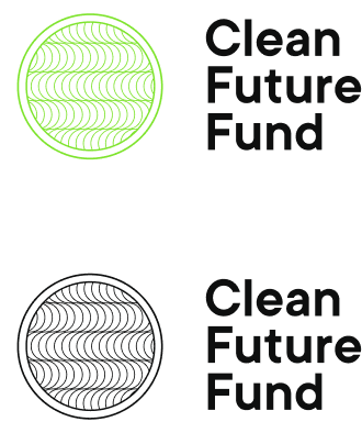
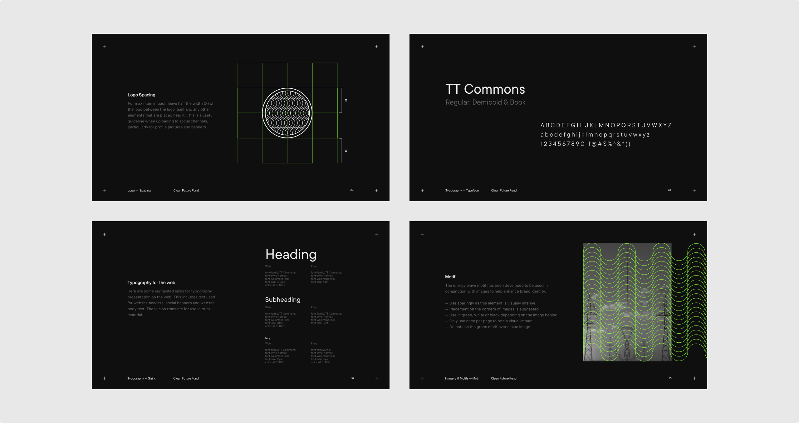
The logo is a symmetrical, abstract representation of the AC-DC current going back and forwards. It is encapsulated in a circle to provide maximum usability in terms of placement and scaling, as the pattern’s recognisability decreased without an outer shape to hold it together.
TYPOGRAPHY
The typeface is TT Commons, which is an elegant San Serif typeface with a slightly round feel to counter its otherwise rigid proportions. This was chosen because it mirrored the lines and curves in the logo, while also being contemporary, clean and easy to read.
COLOUR
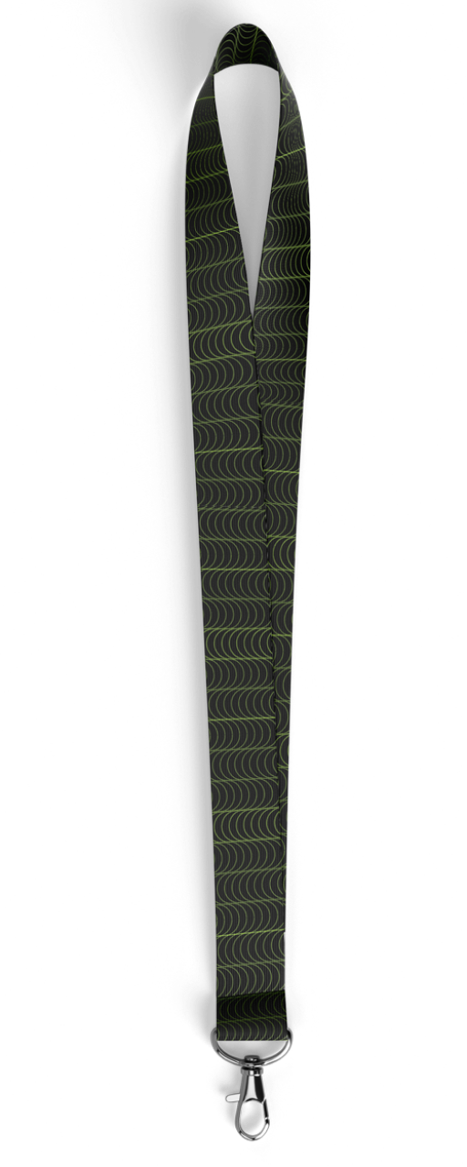
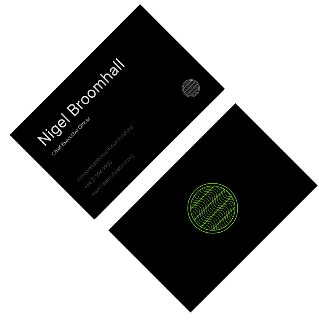
The colours were chosen to make the company stand out. Most EV and Green companies rely on the same crisp, white colour palette. While this is a nice approach, it is now quite cliché within the industry so a more tech focus colour palette of dark grey was used.
THE OUTCOME
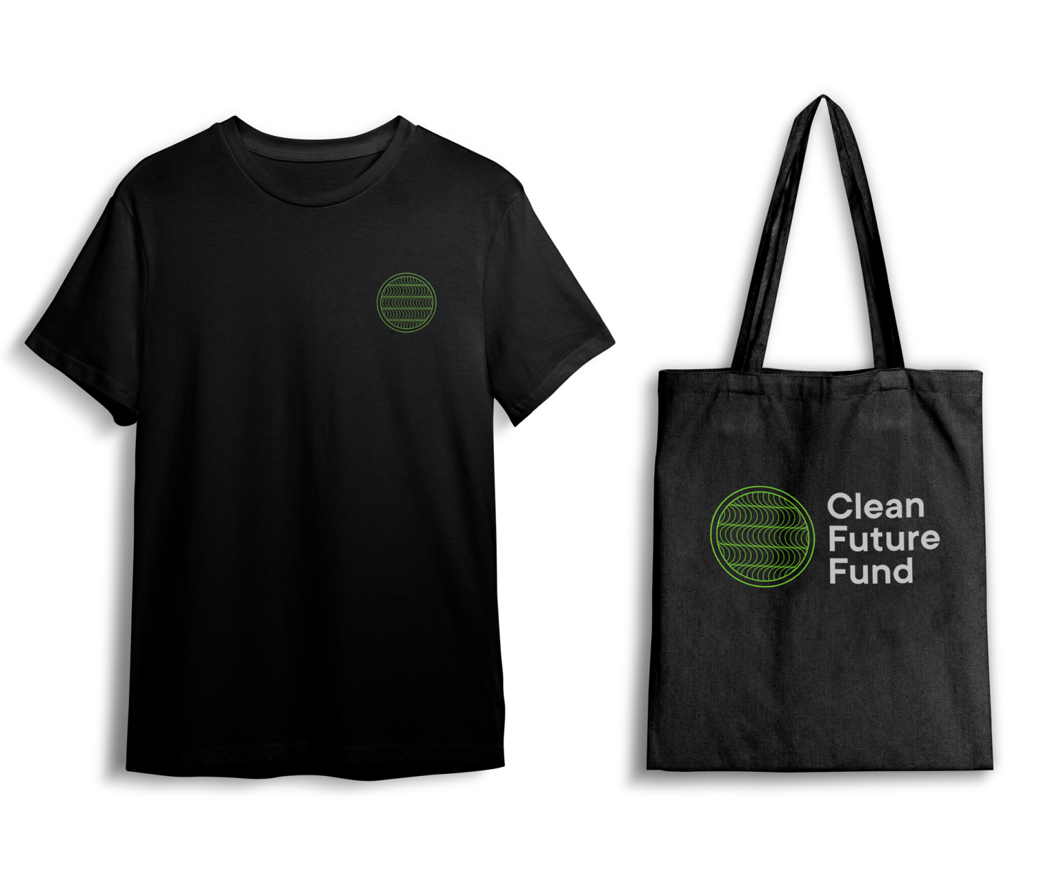
The Clean Future Fund is currently securing funding and grants from both New Zealand and American governments.
Selected Works

Google Digital GarageProduct, UI, UX
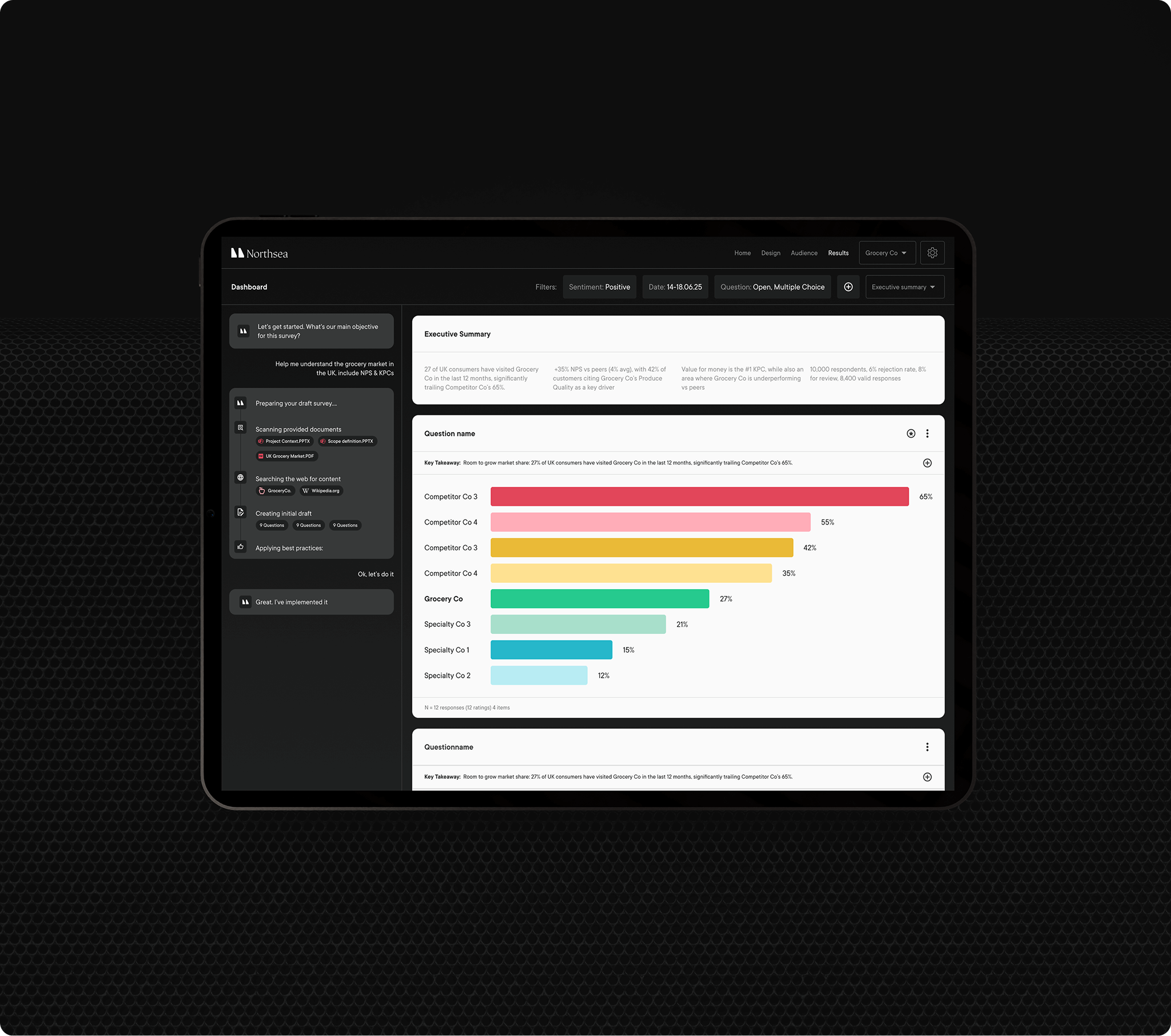
Northsea AIProduct, UI, UX, Branding, Strategy, Visual Identity

Magpie AIProduct, UI, UX, Research

HSBCProduct, UI, UX

Origin AIBranding, Design Direction, UI, UX, Product

ExodusProduct, UI, UX, Design Direction, Branding

House of Healing BerlinVisual Identity, Design Direction, UI, UX

HubrickProduct, UI, UX

SportninjaProduct, UI, UX, Branding, Strategy

Bain & CompanyProduct, UI, UX, Branding, Leadership, Strategy