HSBC
BRIEF
Redesign HSBC’s internal communication system to increase usability and functionality
EXPERTISE
UX, Visual Design, Work Facilitation, Product Design, User Testing
RESULTS
- Greatly reduced dependencies on legacy systems
- Created a new design system with a focus on ease of use and accessibility
- Substantially reduced average time taken on tasks
HOW I WORKED
I was brought on as a senior designer to redesign HSBC's internal software and create a design system for this new digital presence. I worked with a team of international agencies to deliver UX journeys and visual design that aligned with HSBC's existing global style.
The primary goal of the redesign was to present a large amount of information to the user while reducing the amount of clicks it took to navigate the system. Staff members had very positive reactions to the changes, commenting on ease of use and readability as areas we improved significantly.
After user testing different navigation systems, we settled on making the navigation swipeable over 3 main information panels split up into logical areas. This helped create a mental model which decreased cognitive load, which in turn made the entire system very simple to use.
KEY FEATURES
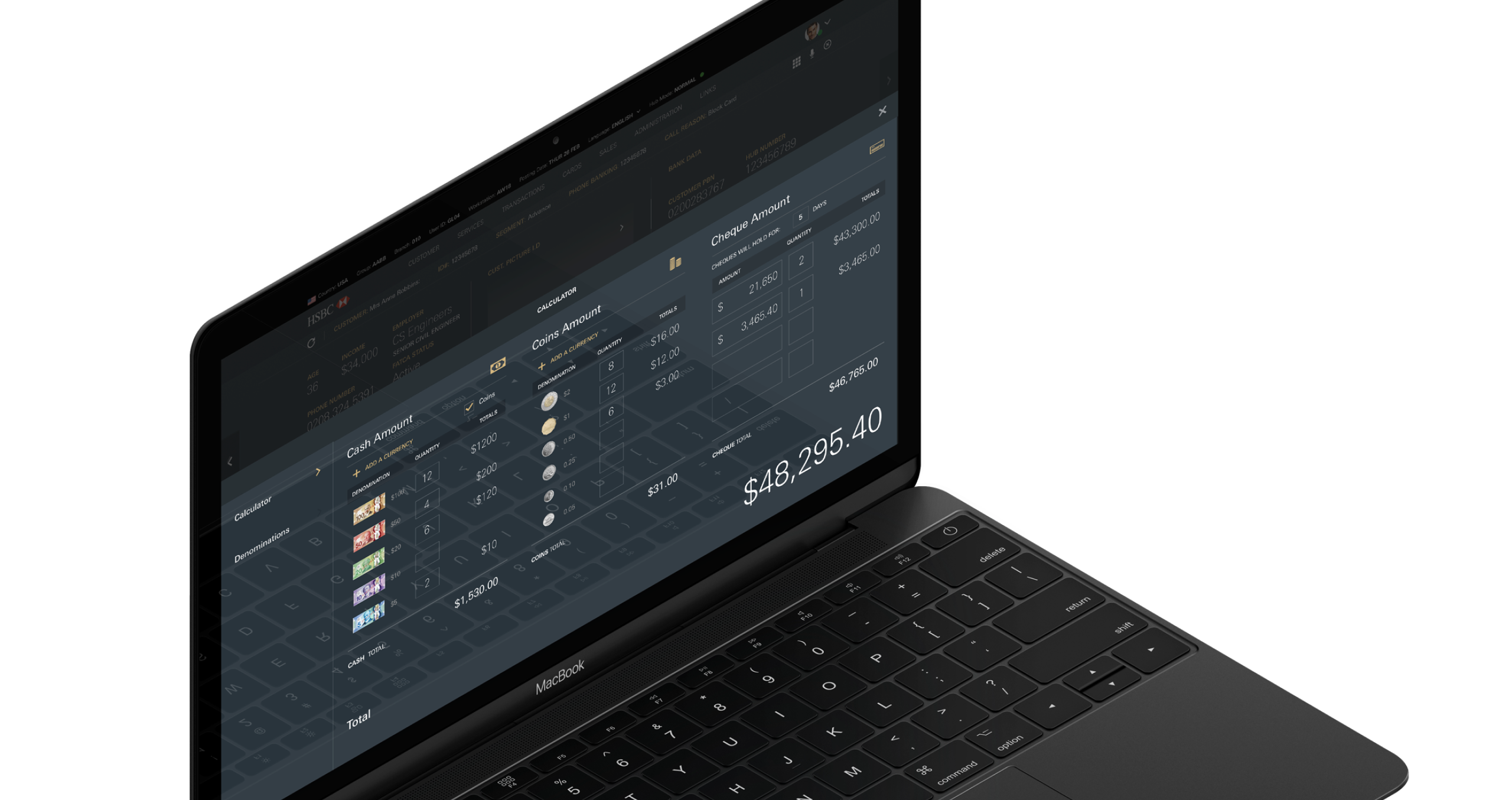
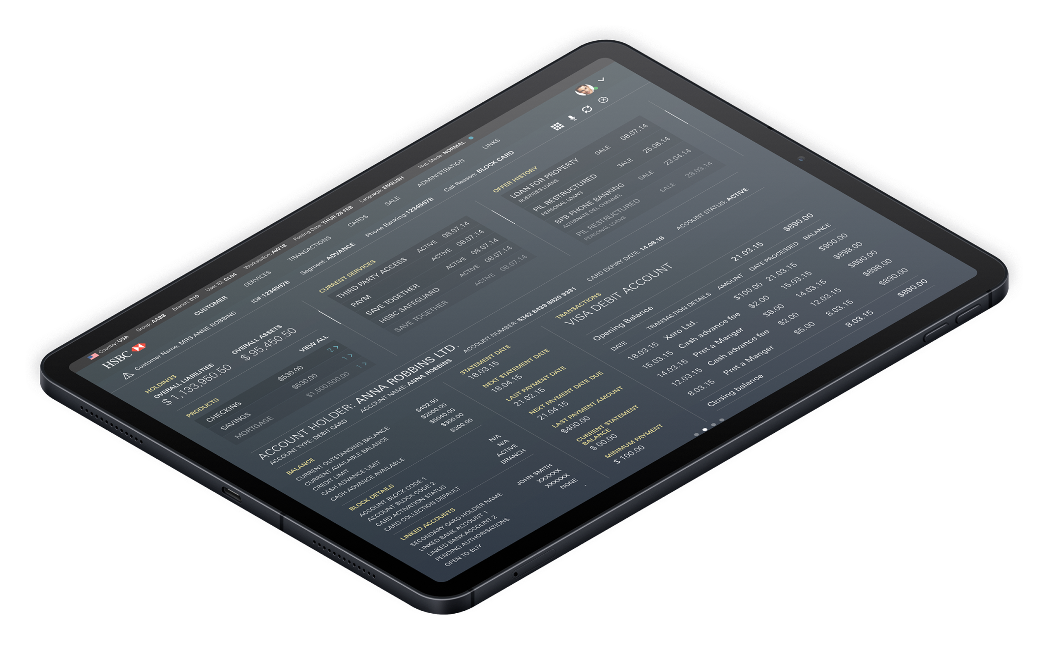
The panels are split into context-sensitive sections that display information related to where the agent is clicking.
This project had to be compatible with WCAG readability standards because of the large range of users that would be working with this system daily. We used a high contrast colour palette and graphs to ensure that information could be scanned and digested easily.
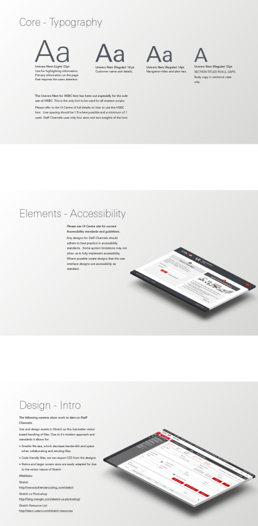
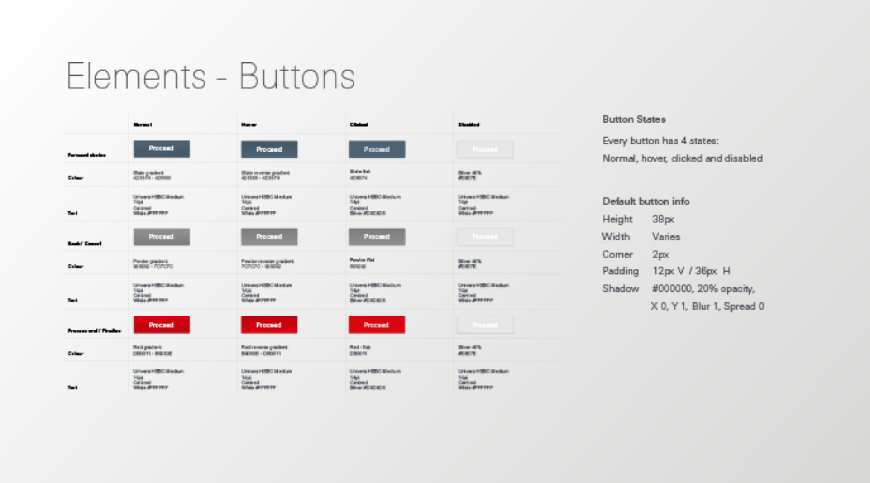
I also created a detailed design system which included elements like typography, colour palette, buttons, links, headings, iconography, tone of voice, international currencies and more.
We also worked with an accessibility agency to promote HSBC's approach on inclusion. This involved having constant touchpoints to ensure alignment on key issues.

THE OUTCOME
HSBC’s agents loved the software and we successfully updated their internal system which had over 20 years of legacy design and code to something modern, usable and inclusive.
Selected Works

Google Digital GarageProduct, UI, UX
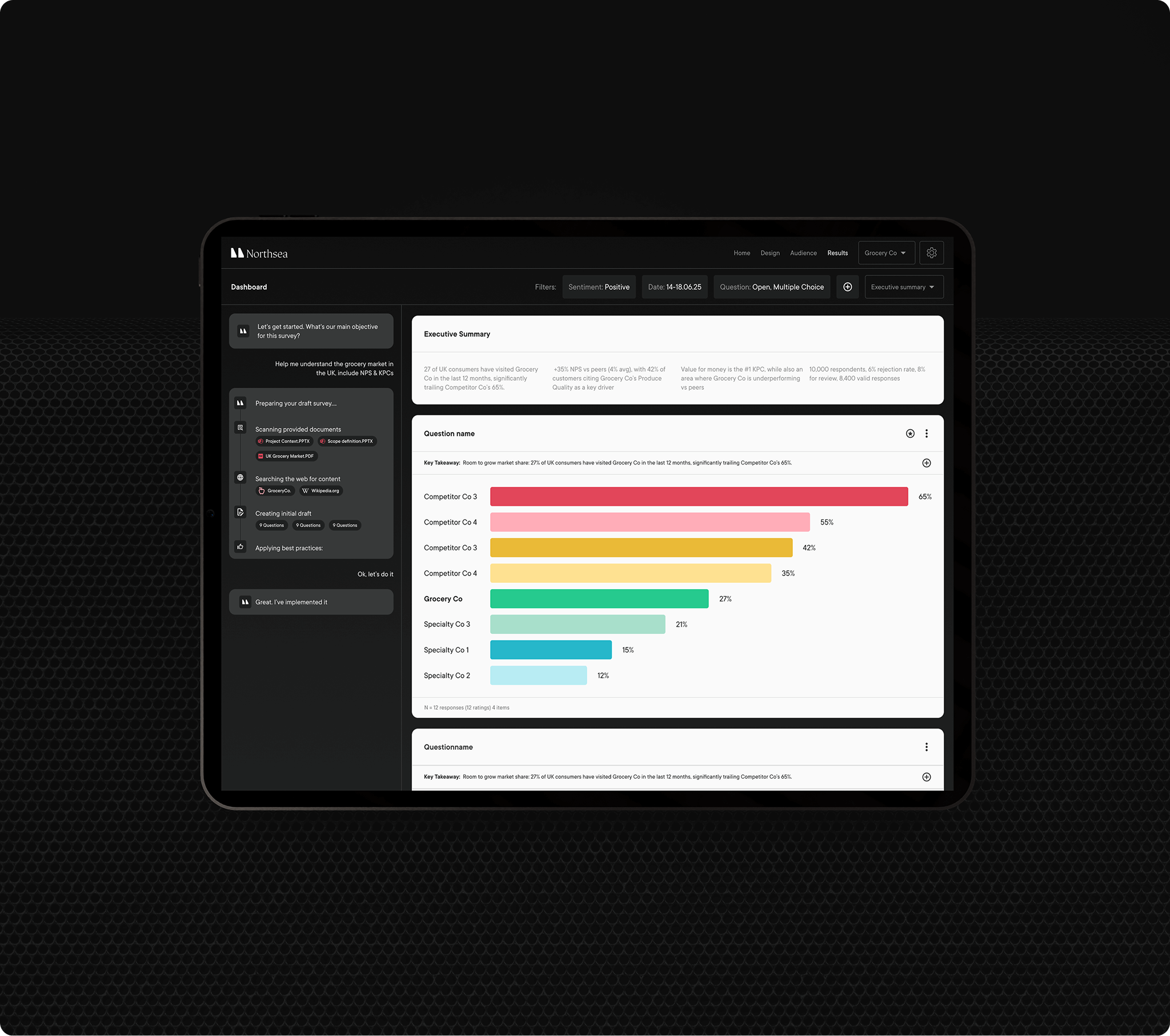
Northsea AIProduct, UI, UX, Branding, Strategy, Visual Identity

Magpie AIProduct, UI, UX, Research

Origin AIBranding, Design Direction, UI, UX, Product

Clean Future FundBranding, Visual Direction, Strategy

ExodusProduct, UI, UX, Design Direction, Branding

House of Healing BerlinVisual Identity, Design Direction, UI, UX

HubrickProduct, UI, UX

SportninjaProduct, UI, UX, Branding, Strategy

Bain & CompanyProduct, UI, UX, Branding, Leadership, Strategy